|
Because of some recent postings on the Hardy Boys Lists dealing with a fellow
fan's personal thoughts on the first 58 books in that series, I was motivated
to do likewise, but with the cover art. Additionally, I extended the range to
include the first 100 plus a few scattered books beyond. Most covers are of the
original text books and likewise most are of the picture cover format. The majority of
the exceptions are dust jacketed covers in the first ten books. Some are this
way because this is the only format they were published in (for original text)
and others are in addition to the original text/picture cover editions.
My thoughts are surely subjective and more than likely the reader of these series of posts, now transformed into an essay of sorts, will fervently disagree with me on many occasions. This is as it should be! For organizational purposes I had divided my train of thoughts into groupings of ten covers, as opposed to the various "eras" utilized on the posts dealing with the stories themselves.
To deal with this subject matter properly would be an ideal topic for a college
thesis paper. Still, I hope that the article that follows will be of interest to
other fans of the Hardy Boys. For let's face it, when a particular book is
mentioned, more often than not it is the cover art that first comes to mind. At
least that has been so with me. So join me now as I take a journey through the
years, from the days of roadsters and chums to the new millennium!
I have used Bob Finnan's listing of the Hardy Boys artists from his web site ("The Hardy Pages") for the first 58 books, as a reference. However, I may have occasionally fouled up on the actual publication date of a few books and noted the wrong artist. Surely you'll understand those mistakes to be mine only.
To begin this essay, let me say that I do have a nice dust jacketed "Tower Treasure"
as well as a revised picture cover. This is one of the few instances where the title
did not come out in pc/ot. My dj lists to "Hooded Hawk" and shows a jacket
and tied Hardy Boys gazing up at the Applegate mansion. I assume that A.O. Scott is the artist since he drew this cover in 1944 and "Hooded Hawk" was written in 1954. The pc reminds me a little of the "Haunted Fort" cover, very dark but more detailed and distinct. While looking ahead, I note that Rudy Nappi was responsible for both those covers. The boys are sweatered with collars exposed. I like both covers for different reasons.
The same is true with "The House on the Cliff," (a dj by A.O. Scott and revised pc by Rudy Nappi). Basically the same scene is shown but with slightly different nuances (like the nature of the cliff).The "Napoli" takes center stage in both which are among my favorites.
"The Secret of the Old Mill" I finally obtained in the ot/pc format. I say this because I understand it is relatively scarce. Joe looks like Ricky Nelson as he and Frank peek through the crack in the floor of the mill. Nice background showing the innards of the mill. The dj version by Scott is similar but lacking the detail of Nappi.
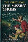
"The Missing Chums" I also have in dj and pc (both ot). The covers show
almost the exact same scene: the Hardy Boys in the Sleuth on a storm tossed
Barment Bay. Neither is among my favorites though both Scott and Nappi are the artists.
"Hunting For Hidden Gold" is in dj and ot/pc. Both depict the same
so-so scene. I do like the western style scarfs on the dj version. This time while Nappi is still drawing the pc, it is Stricker who draws the dj.
"The Shore Road Mystery" has two very different covers. The dj shows a
roadster driving near the edge of a cliff in the rain, while the ot/pc has
the boys looking down on two men tied up on the bleak shore of Barment Bay. Since the dj lists only to "Broken Blade," hence 1942, I assume that Rogers is that author (Scott drew the 1944 cover). Nappi on the pc as usual. Again, neither is among my favorites.
I always liked the cover of "The Secret of the Caves" (all pc/ot for now on
unless specified otherwise). In addition, all future cover art will be by Rudy Nappi until that changes and will be noted. Here the Hardy Boys are watching the hermit (evil looking) entering his cave. Very well depicted!
"The Mystery of Cabin Island" portrays a very young looking pair of brothers
as they peer on events outside the cabin during a snowstorm. One of the best!
I was bored silly with "The Great Airport Mystery" cover. Frank and Joe look for clues with a tail of an airplane in the background.
Lastly (for now), the "What Happened at Midnight" cover is so dark, as Frank
and Joe walk outside the party. Looks like a lake in the background. A perfect
cover for this title!
Continuing my cursory march through some of the Hardy Boys cover art, I see
that I have both dust jacketed (ot) and picture cover (revised) formats of "While the Clock Ticked." It was the revised that I first read as a child and the cover art
(Nappi) is incredible! I can see the terror in Hardy's eyes as the villain
(Arthur Jenson?) leaves via grandfather clock. The ot version (Bill Gillies this time) is similar but simply doesn't convey the same level of terror.
"Footprints Under the Window" clearly shows Bill Gillies name and Joe looks
tough while the oriental man inside, inscrutable. Nice dock though. I have
most of the revised books up in my attic. Only those I read back in the early
to mid sixties have managed to stay on display. Space problem you know.
"The Mark on the Wall" (again, all now are pc/ot unless specified otherwise),
is a forgettable entry by Gillies.
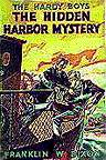
"The Hidden Harbor Mystery" I have in dj/ot (boring cover by Gillies) and in
pc/rt (Nappi) with a great picture of a gator attacking Joe in the Everglades during a
hurricane. A better cover (one of the best) and a better story!
The cover for "The Sinister Signpost" is simply a vehicle for Frank to give
an butt shot, as he and another (not Joe!) look down on some villains. A typical Gillies.
"A Figure in Hiding" always fascinated me as I never owned or read it until later in life. For some reason the greenish night sky intrigues me. John Leone does a very good job with this cover. I am told there are variations, concerning the hue of the sky.
"The Secret Warning" cover art seems sort of childish, what with the written warning and the look on Joe's face. We are back to Nappi again.
The cover for "The Twisted Claw" is among the best! What a suit of armor and
Frank is portrayed just right. I am not surprised to note that John Leone is again the artist.
"The Disappearing Floor" strikes me as OK. The Boys look good though as does the "ghost." Leone drew this relatively rare pc/ot cover.
I really like the cover of "The Mystery of the Flying Express."
Something about the way the train is passing through (with the conductor
peering out) and the Hardy's rushing to retrieve a package as they are
observed from the shrubs. Nice use of yellows in this cover. I think I prefer the art of John Leone on the picture covers, so far.
At first the scene portrayed on "Clue of the Broken Blade" seems lackluster
but I do remember what could the circumstances be surrounding Frank and Joe
looking at the shattered sword. Those blinds directly behind add to this
picture. Leone let me down here.
"Flickering Torch," now here is a cover! I just wish the letter "R" was not
covering most of the hooded villain on the cliff. The churning sea, Frank and
Chet looking up from the canoe, the dark cliff and the torch itself all add up
to a great cover. Leone redeems himself tenfold here! Side note: because Scott (my inspiration for these posts) has several times mentioned he likes both versions of this book, I just went up to my attic and pulled down the revised (no small feat, that). I will give this book another chance because I feel there must be something to it if Scott says so. I must say that the cover is simply dreadful but won't let that influence my judgment, nor the fact that the original plot was totally changed.
An interesting cover to "Melted Coins." Looks like Chet is gazing down into a
pit or cave with Frank, as Joe attempts to climb out, spilling his bag of
coins in the process. The pines in the night sky are a nice finishing touch. Leone again.
I really like the winter scene on "Short-Wave Mystery" where the boys are
spying in on a cabin window and fiddling with the short-wave radio.
Footprints, wintry pines, and a flashlight all add to a well drawn cover. Thank you Leone!
What a curious scene shown on the cover of "Secret Panel." Frank and Joe
have just opened up said panel and surprised a man in bed and his nurse (by his side). She is extremely good looking and from both expressions, it looks like they got
caught playing doctor! Nice horseshoe too. It looks like Russell Tandy's cover art was still in use with this book, until 1970.
"The Phantom Freighter" shows a nice drawing of vessels at sea and the boys in action. Night time of course! Great looking beams from the flashlight and searchlight. Tandy continues to dominate.
A very odd illustration on "Secret of Skull Mountain." A very nice and eerie
mountain itself but the scale seems all wrong, with Joe and Frank finding a
skull and gazing up at the skull-like peak. The background is blase but
fitting. And the streak continues.
Another great forest scene on "Sign of the Crooked Arrow." Nice trees, Frank
and Joe with horses, the arrow itself and a deadly archer in the background!
Very nice! Tandy continues to excel.
"Lost Tunnel" is another Bill Gillies and is OK. The boys gesturing deeper
into a cavern with a rather obvious looking villain giving them nasty looks
by the entrance.
The 30th book, "Wailing Siren" is another Gillies effort and one of my
favorites. Nice fight on the Sleuth and interesting background (destroyer and
helicopter).
I like the Bill Gillies cover of "Wildcat Swamp." The mountain lion is just
right as is the scenery.
"The Crisscross Shadow" cover art is pretty neat, with Frank and Joe just
realizing they are being spied upon. Nice teepee and the shadow itself is
effective. Nappi's back!
I'm not sure why but "The Yellow Feather Mystery" cover though well drawn,
seems a copy of sorts of "Cabin Island." Nice winter scene though. Nappi again.
If only the story were as good as the cover of "Hooded Hawk." An incredible
forest, great shots of the Hardy's, a turbaned villain and of course the hawk
(unhooded), all make for a top notch piece of art! Way to go Rudy.
"The same holds true for "The Clue in the Embers." Great cover but the story
was lacking. I mean, these guys are inches away from flowing molten lava!
And a nice red river it is. A streak for Nappi!
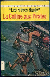
"Pirates Hill" does little for me, despite the good underwater detail. That
shark could be trouble ... Nappi falters here.
As for "Skeleton Rock," the plane afire with the panic stricken Hardy's inside
looks scary, but I love the coastline below, with the palm trees (I have a
thing for palm trees) and of course the human shaped peninsula. Resurgence for Rudy!
"Desert Paw" shows a colorful totem, green woods, fleeing Hardy's and
naturally, the paw of the devil! Another of my favorites. The legend continues.
"Chinese Junk" shows the sleuth that Paul likes, the sleek one . An
interesting junk with a yellow sky. Not bad, but a notch down for Rudy.
Lastly, # 40 "Desert Giant" seems simple enough yet it captivates me. Part of
this could be the mystique with which I hold this book but I think the art
has merit on its own. Behind a natural rock barrier at night, Frank and Joe
espy a smuggler receiving a package by parachute and the desert giant is lit
up near him. There is just something about this scene that sticks with me. Thank you Rudy Nappi!
Someone else agreed with me recently. The cover of "Screeching Owl" is
one of the best and the first (not counting revised) to utilize the boys in the
foreground and a huge dominating presence in the back. In this case, the
eerie head of a screech owl takes up most of the night sky above Black Hollow.
This scene never happened but it's a joy to look at. Nice tree line as well. A different style by Nappi but an extremely well drawn! In fact Rudy draws the remaining covers for the G & D editions, through # 58.
"Viking Symbol" is also a very good one. Frank and Joe in action and a
vague but haunting background caps this cover off.
The "Aztec Warrior" cover is as bad as the book itself. Not badly drawn
but the scene just doesn't grab me (and I'm into the Aztecs, Mayans, Toltecs, etc.).
Just incredible! "The Haunted Fort" artwork is better than the book. The
ghost, the fort, the lake, Frank and Joe, even the tree and moon, all
combine for a first rate cover.
"Spiral Bridge" always impressed me by its' use of pastels (the aura in
the cave and above it) in conjunction with the generally dark remainder. A
nicely drawn cave and the shrubs near the spying Hardy's are very detailed.
"Secret Agent on Flight 101" has promise (much more than the story).
Frank and Joe running from a plane with the pilot, ties awhipping! One would
think a bomb was about to go off.
"Whale Tattoo" is the second cover that has the brothers running for
their lives in the foreground, with a menacing figure in the back. Strangely,
I like this one. Could be the tattoos on the man giving the boys the evil
eye.
I must admit (for some reason I don't want to, maybe because the books
weren't so good), I like the cover to "Arctic Patrol" as well. Frank and
Joe are in the foreground again (but not running though they do look worried). A
wrecked plane and huge polar bear dominate the back. Nice transition
from whites on the bottom to grays up top.
"Bombay Boomerang" is about the worst cover yet. We see the Hardy's
(upper parts only), a large boomerang, a freighter being unloaded and an orange
background. I am starting to find it hard to believe that these remaining covers were all drawn by Rudy Nappi. The style seems so different, yet, it is so.
Oh, oh. I found an even worse cover! "Danger on Vampire Trail" has a green background, the heads only of Joe and Frank, plus some vague bats. Not good at all.
I've simply got to rattle off some really bad covers. They generally show Frank and Joe in the foreground with an image concerning the title in the background. They are: "Masked Monkey," "Shattered Helmet (blue background)," and "Hissing Serpent."
The next two books are an improvement. "Mysterious Caravan" shows Frank and
Joe in some keen robes, watching a passing caravan. Not bad for an all yellow
cover. "The Witchmaster's Key" is a nice use of brown shades and the witchmaster is well conveyed.
My first instinct is to reject the cover for "Jungle Pyramid" but a second
look makes me appreciate it more. It is a very different sort of illustration
as the Hardy's race up the pyramid stairs towards a yellow opening. Again,
nicely done in browns!
Except for the nice pale greens and the map of Australia, "Firebird Rocket"
is a disappointment as is "Sting of the Scorpion." Nice elephant though.
Now for the first of the paperback Wanderers. "Night of the Werewolf" is
illustrated by Leslie Morrill and is given credit for doing so. I like the way
the wolf's head is ghostlike and peering over the forest. Frank and Joe are
in the front by a river. I like it!
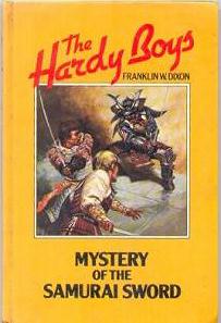
Number 60 "Samurai Sword" was not nearly as good, even though also done by
Morrill. The Hardy's look different and not as good. Too modern a cover for me.
The next four book covers (61-64) are drawn by George Gaadt. Of these I enjoyed only the last. "Smugglers Cove" has a nice woodsy scene, complete with log cabin, bad guys, Frank and Joe spying and an alligator creeping out of a pond. Nice use of greens! The others show scenes from the Amish country ("Pentagon Spy"), a cruise ship at night ("Apeman's Secret") and an Egyptian tomb ("Mummy Case").
The remaining six covers in this grouping of ten, were drawn by Steven
Assel and I like his style much better.
"The Stone Idol" portrays the Hardy's in a way I can relate to. Nice
Easter Island background and a difficult rendition of a man disguised as a bird
of sorts, looking down at the boys as they avidly discuss something.
"The Vanishing Thieves" shows Joe and Frank in a city and their clothes are
realistically drawn. Nice work with the blues and reds. Look out for that
monkey wrench!
"The Outlaws Silver" has a fairly weird scene, with a ghostlike creature
threatening the Hardy's, in the woods. But it works for me!
I really think that the cover of "The Submariner Caper" is well drawn, except
for Frank. He looks pudgy and brooding. The cove, submarine and woods really
do make this picture!
Being a fantasy buff, I immediately fell in love with Assel's work on
the cover of "The Four-Headed Dragon." Both the dragon and the mansion it is
above look magnificent! Nice detail on the grounds and gate.
Sadly, I was disappointed in the cover of "The Infinity Clue." Nuclear power
plants and a space-age Frisbee make up most of this cover. The Hardys look
suitably alarmed.
Paul Bachem does a credible job on "Shield of Fear," showing Frank and Joe narrowly escaping a room in flames. Sadly, the colored frame to the balance of the Hardy Boys covers, has nothing to do with the picture itself. No more color coordinated.
It is starting to look like Paul Bachem is settled in as the Hardy Boys illustrator. He continues with "The Shadow Killer," a rather hokey one where the Hardy Boys confront a ninja warrior.
I've gotta say, I'm having a difficult time continuing with this post. I really don't like to be critical, as it is the positive aspects of the early cover art which inspired me to begin these post originally. But for completists sake I'll finish.
"The Serpent's Tooth Mystery" has the brothers confronted by a pretty menacing and evil looking cobra. Aside from this serpent, there is little else of interest in this cover. Consider all remaining covers in this post to be Bachem's unless stated otherwise.
"Breakdown in Axeblade" has a much more interesting title than cover. Joe and Frank are teetering on a cliff's narrow ledge while a helicopter adds to their panic. Despite sounding like a decent cover, the reality is that it appears quite generic.
Hitting rock bottom, the cover art of "Danger on the Air" takes us there. The Hardy's just escape an explosion on a TV set. Really bad!
"Wipeout" portrays a manly looking Hardy Boys off the coast of the French Riviera. Just plain boring, despite the rescue attempt and Sunbird in the background.
Finally! My old flame Callie Shaw is shown on "Cast of Criminals!" And this fox is the only redeeming feature of this cover. The menacing smoke looks more cloud like than dangerous. But Callie now! I just knew there was a reason for me to finish this post and she is the reason, the dark haired beauty. Didn't she used to be light haired? At least she is still vivacious!
Explosives in a truck about to ignite are all that "Spark of Suspicion" has to offer on its cover. Naturally Joe and Frank are on hand to register alarm at this state of affairs.
In "Dungeon of Doom" the boys are attacked with a spiked ball on a chain (the actual term is "mace" maybe?) escapes me. Nice weapon but precious little else.
Paul Bachem completes this entire grouping of ten with perhaps his best effort in the lot. "The Secret of the Island Treasure" has Frank and Joe opening a treasure chest. Not too bad but the luminous sea and could that be the Applegate Mansion twinkling in the background? Not a great cover but far better than the prior nine were.
Despite my avowal to stop collecting the Hardy Boys at # 100, I did somehow end up with a few beyond that nice even number and will talk of them in my next post. Again, my apologies for the negativity in this and other recent posts. I truly did try to find the good in these covers but found the task daunting. Plus, I have not read these last dozen books. That may have something to do with my opinion, but I really doubt that.
All right now! I have managed to pick up three more Hardy Boys digests,
despite my vow to stop at 100. I now suspect I will continue adding more on,
slowly though.
I picked up # 101 "The Money Hunt" recently and I must say, Paul Bachem did
a great job on this cover! A nice stream meandering through dark woods and
an incredibly vicious bear provide the focal point. Look at that bear!
Because of the title to # 139, I picked up "The Search For the Snow Leopard."
This animal is my favorite in all the world. In a new format containing no
colored frame whatsoever, Lee MacLeod does a credible job on the big cat but
fails elsewhere. One of the Hardy's (hard to tell by the hair color), is
crawling above the leopard. A cartoon-like background of the sky and palm
trees adds nothing to the cover.
My last digest (for now), is # 162 "The End of the Trail." Again, I bought it
for the title which I thought might indicate the last book in the series.
This was not so (thankfully). Jeff Walkers allowed only between 1/3 and 1/2
of the cover to work with and draws a very different type of cover (no Hardy
Boys or any humans at all). A tantalizing view of an Appalachian town looks
like something out of the Twilight Zone. This may be, but I like it a lot.
Lastly, I've thrown in the cover to the Hardy Boys and Tom Swift Ultra
Thriller "Time Bomb." Romas Kukalis does a less than inspiring job on this
one. All three heroes are combating an evil robot. Just not much to it.
| 
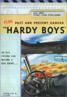
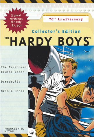 Three new Hardy Boys related books have been announced for release this fall:
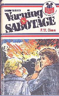 Hardy Boys Swedish Edition
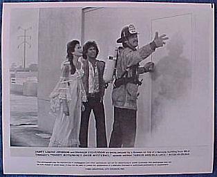 Publicity Photo
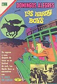 Spanish Comic Book